One Cleveland
Building a civic identity into a multi-channel publishing system.
I helped create a civic identity that grew into an ongoing campaign spanning web, email, social media, video, and weekly editorial content.
[01]
Creating a family of civic identities
One Cleveland began as a second phase of an assignment for Cleveland’s 230th anniversary. The two initiatives needed to feel related without becoming interchangeable. What started with a pair of logos eventually became a flexible system for sharing stories about the people, organizations, and communities that have shaped Cleveland.
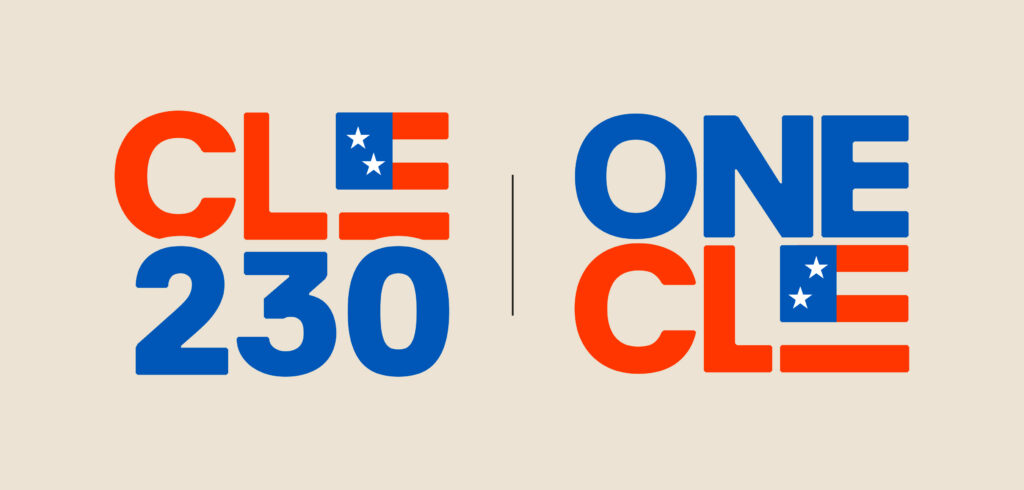
The original assignment focused on Cleveland 230, an identity recognizing the city’s 230th anniversary. One Cleveland was planned as a related public campaign, so I began by developing the visual foundation the two could share.
I produced roughly 40 to 60 Cleveland 230 concepts, moving from typographic studies to complete identity directions. I wanted the mark to feel civic, celebratory, and contemporary without becoming overly formal or historical. The selected concept used a bold typographic structure and a flag-inspired treatment within the letter E. Its palette referenced the new America 250 identity, creating a connection to the national anniversary while remaining distinctly local.
For One Cleveland, I reorganized that same typography, palette, and flag-inspired E into a related mark. The relationship between the L and E also formed an arrow-like area of negative space, suggesting connection and forward movement without adding another symbol.
The goal was not simply to create two logos. It was to establish a recognizable family for two connected civic initiatives.

[02]
Testing the identity as a system
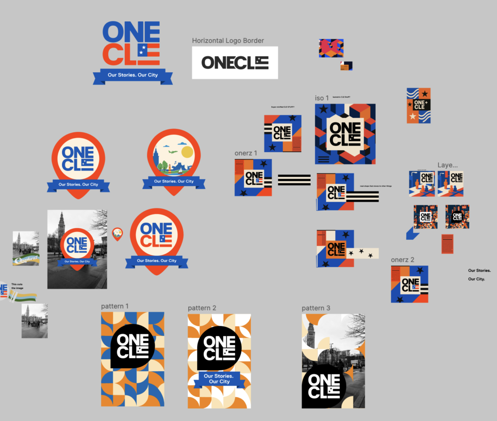
I presented the initial concepts through real campaign applications rather than isolated marks. The presentations included full-color and single-color versions, posters, photography treatments, supporting graphics, messaging, and connections between Cleveland Public Library, Cleveland, and America 250.
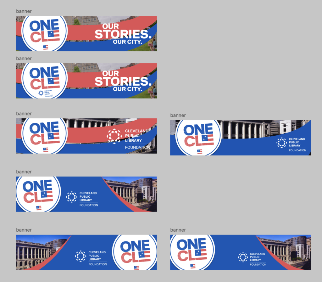
Leadership approved my One Cleveland identity direction, and I worked with the lead designer and design team to expand it into a broader campaign language. We explored map-based, isometric, geometric, editorial, and photographic approaches. Leadership selected the lead designer’s more restrained campaign direction, which paired my One Cleveland logo with documentary photography and a simple red-and-blue swoop.
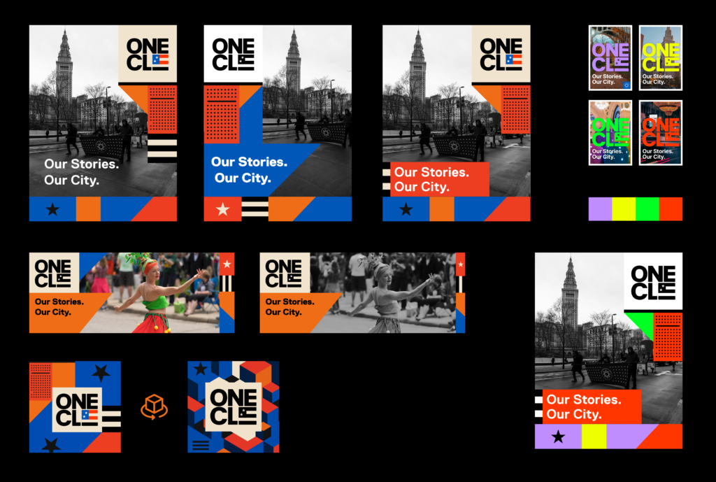
The simplicity proved valuable. It kept the emphasis on Cleveland’s people while giving the campaign a consistent structure. The swoop also created a dependable area for large text over photographs with different compositions, colors, and levels of detail.
I explored banner layouts until the system could consistently support the campaign badge, photography, “Our Stories. Our City.” messaging, CPL branding, and many digital dimensions without forcing every asset into the same composition.
The identity became successful when it could support changing stories, channels, collaborators, and deadlines without losing its character.
[03]
Carrying the campaign across channels
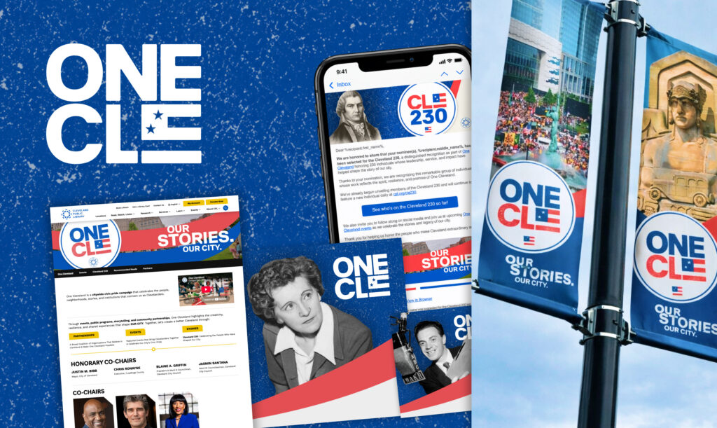
The identity had to work inside real production tools and team workflows. I collaborated with the email team to establish reusable assets and templates in LibConnect, learning the constraints of the delivery platform and adapting the system rather than handing off disconnected graphics.
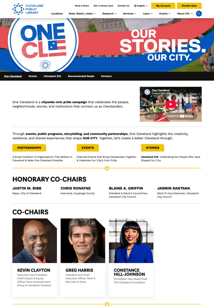
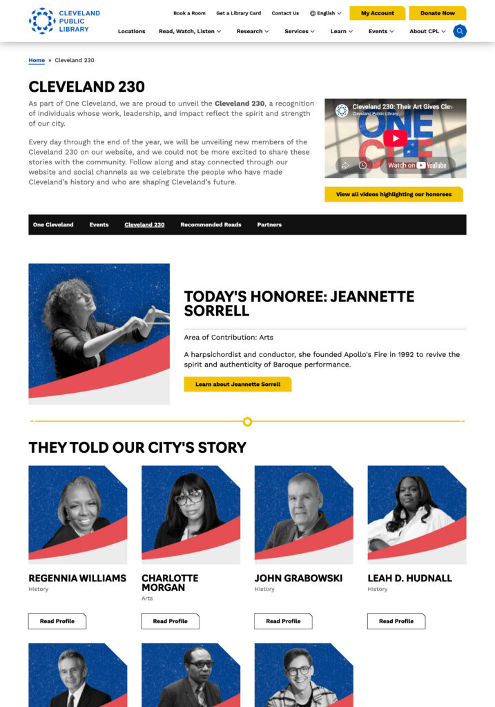
I also designed and built the One Cleveland microsite as a child of CPL.org. It brought campaign information, events, partners, leadership, sponsors, video, recommended reading, and Cleveland 230 profiles into one public experience.
The microsite needed to feel distinct while still working within CPL’s navigation, technical structure, accessibility expectations, and publishing system. That balance allowed the campaign to have its own identity without behaving like an unrelated website.
One Cleveland and the microsite launched in May 2026.
The campaign system extended one story across multiple formats while the microsite gathered the public experience into one accessible publishing structure.
[04]
Turning profiles into a publishing system
Although Cleveland 230 was the original assignment, it became a supporting editorial series while One Cleveland grew into the primary public identity. Seven honorees were published at launch, followed by seven new profiles each week.
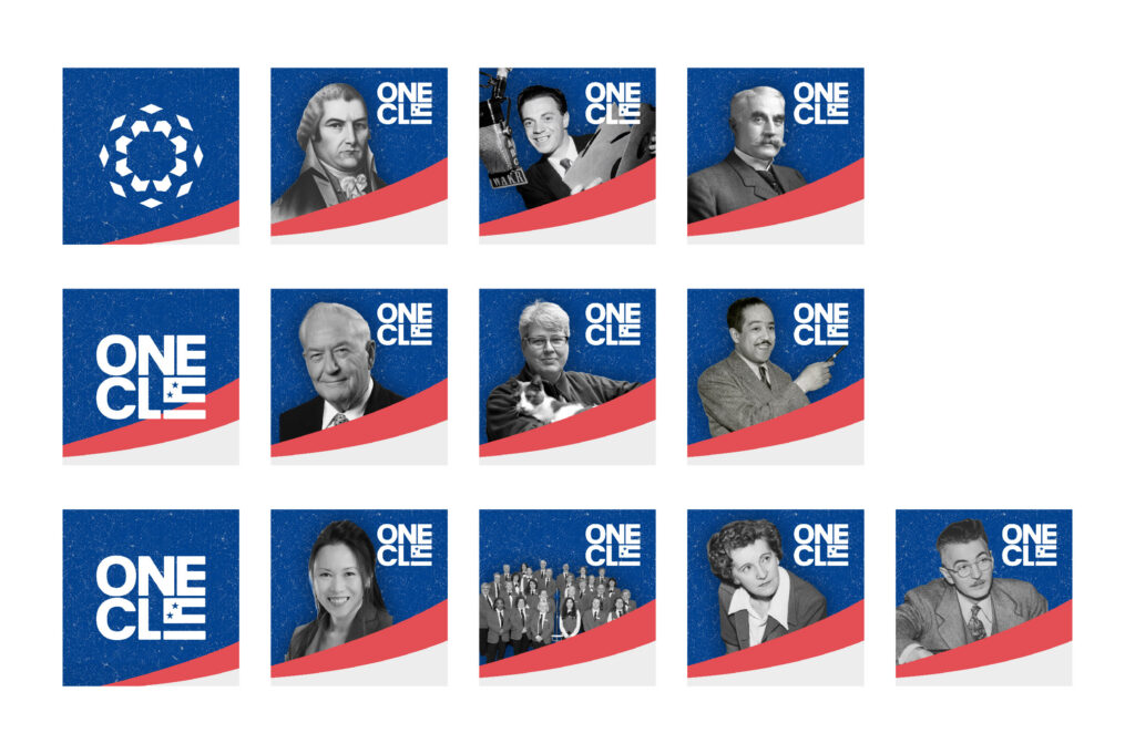
The series needed to accommodate historical and contemporary portraits, individuals and groups, inconsistent source images, and assets for web, social media, email, and video. I created reusable templates that maintained a consistent relationship between portraiture, textured backgrounds, the campaign swoop, the One Cleveland identity, and CPL branding.
My role expanded into coordinating with the project researcher, social team, video team, and other contributors. Each cycle involved gathering biographical material and images, preparing portraits and campaign graphics, updating templates, distributing assets, and publishing the website profiles.
By establishing the structure early, the team could concentrate on each honoree’s story instead of redesigning the campaign every week.
[05]
Adapting the experience as it grew
The launch site was designed around an initial set of profiles. As the archive expanded, the experience needed to evolve with it.
I added featured profiles, clearer content groupings, and an expanding honoree archive. I also began working with the lead developer on filtering functionality so visitors could navigate the collection more easily as publishing continued.
This became an important stewardship problem. Growth was evidence that the campaign system worked, but it also created new usability needs. The website could not remain frozen at launch. Its structure had to respond to the volume of content it helped produce.
[06]
Outcomes and reflection
By the tenth week of profile publishing, the work included:
- Two related civic identities
- A flexible campaign language
- A public microsite and growing archive
- Reusable social and email templates
- Seven launch profiles and seven new honorees each week
- A repeatable cross-team production workflow
- Ongoing design, UX, development, and brand stewardship
Formal public-response data is limited, but leadership consistently reported strong enthusiasm. Requests for shirts and other branded merchandise became a recurring sign that One Cleveland connected with people beyond its original digital applications. One Cleveland ultimately became the more visible campaign, while Cleveland 230 continued as a supporting series.
The project required me to move between identity design, UX, web development, content structure, production, and maintenance. It reinforced that a successful identity needs more than a strong logo. It needs a system flexible enough to handle changing content, simple enough for a team to maintain, and structured enough to remain recognizable as it grows.
That is what One Cleveland became: not a collection of matching assets, but a durable framework for publishing Cleveland’s stories.